Most roadmaps do not become unmanageable because founders keep having bad ideas. They become unmanageable because every idea has a plausible user, a convincing use case, and usually a successful competitor you can point to as evidence that it should exist.
That was the problem I ran into while building Tansei, a shelf that sits at the edge of your Mac screen and holds the things you are actively using: prompts, screenshots, files, links, colors, notes, code snippets. You put something down, keep it within reach while you move between apps, and clear the space when the work is finished.
It also has project folders, tags, and clipboard history, but I did not want another large productivity system that had to be constantly organized. The shelf is the center of the experience.
Tansei launched on the Mac App Store today. Reaching that point required me to stop asking whether a feature would be useful. Almost any feature is useful in the right circumstances.
The more helpful question was whether it strengthened the product or quietly turned it into something else.
These are five useful features I chose not to include.
1. Accounts and logins
Accounts are so common in software that it can feel irresponsible not to add them. They enable syncing, subscriptions, collaboration, user profiles, and a neat way to connect behavior across devices.
They also create work that has very little to do with the product’s main purpose.
Once you require an account, you inherit password resets, email verification, authentication errors, security responsibilities, account deletion, and support requests from people who simply want to open the app and use it.
For Tansei, that felt like unnecessary distance between the user and the tool. The app works offline, stores its contents locally, and does not require a login.
The lesson for me was that accounts are not neutral infrastructure. They change the relationship between the user and the product, and they should earn their place like any other feature.
2. A built-in AI assistant
Tansei is often used alongside AI tools, so adding an assistant would have been easy to justify. It could rewrite prompts, summarize text, organize notes, or generate content directly from the shelf.
It would also have made the product easier to market. Adding “AI-powered” to a landing page is a much louder proposition than explaining a quieter workflow tool.
I left it out because I already had several places where I could talk to AI. The problem I was trying to solve was what happened between those places, when prompts, responses, screenshots, files, and snippets had to move from one interface to another without disappearing into the general chaos of the day.
Adding AI would have made Tansei more topical, but it would not necessarily have made it more useful.
A feature can fit the market perfectly while fitting the product badly.
3. Automation
Automation was another tempting direction. An item placed on the shelf could trigger an action, process a file, open another app, or send information somewhere else.
Each workflow sounded small when considered on its own, but automation rarely stays small. It brings triggers, permissions, integrations, settings, error handling, and endless questions about what should happen when an action only half succeeds.
At that point, I would not have been adding a convenient feature to Tansei. I would have been building an automation platform inside it, along with a second interface and a second roadmap.
This was a useful distinction: some features add depth to the job your product already performs, while others introduce an entirely new job that happens to be nearby.
The second type is often where feature creep begins.
4. User tracking and behavioral analytics
Leaving out behavioral analytics was less comfortable because analytics could genuinely help me make better decisions.
I could see where people stopped during onboarding, which features they opened, how often they returned, and which parts of the app were largely ignored. For a newly launched product, that information is valuable.
The trade-off is that Tansei may hold prompts, client information, screenshots, code, links, and unfinished work. Even if I never collected the contents of those items, adding behavioral tracking would make the privacy story more complicated.
I wanted the answer to “What does Tansei collect?” to remain simple.
That means I will have less behavioral data and will need to learn through direct feedback, support conversations, reviews, and the aggregate information available through the App Store.
Analytics reduce uncertainty for the builder, but they can introduce uncertainty for the user. I decided that my uncertainty was the cheaper one to carry.
5. A full image editor
Because Tansei can hold screenshots and images, editing them inside the app seemed like a natural extension. I kept it to quick markup: cropping, highlighting, arrows, text, and blurring anything private.
The problem was not that these features were unrelated. They were almost too closely related, which made them easy to justify.
Once someone can draw an arrow, they will reasonably expect layers, filters, presets, and an editing history they can come back to later. A small markup tool gradually becomes a full image editor, and an image editor deserves far more attention than a handful of controls tucked into another product.
So Tansei stops at quick markup. For anything more, people can move images into the editing tool they already prefer. Tansei did not also need to reproduce that tool.
This taught me that adjacent features can be more dangerous than unrelated ones because they rarely look like a distraction at first.
The filter I ended up using
I did not have a formal framework when I began building Tansei. The filter emerged after repeatedly finding features that were sensible on their own but confusing in combination.
Whenever I considered adding something, I started asking:
Does this make the shelf better, or does it create another product inside it?
Project folders and tags stayed because they help people separate active work without changing the main purpose of the app. Clipboard history stayed because sometimes you do need to retrieve something, although the interface does not treat a large archive of past items as the center of the experience.
Drag and drop stayed because it reflects how people already move files and images on a Mac. Keyboard shortcuts stayed because they make the app faster. The ability to expand, collapse, and hide the shelf stayed because something at the edge of your screen needs to remain available without becoming irritating.
None of those decisions made Tansei sound as ambitious as an AI assistant, automation system, or image editor would have. They did make it easier to understand.
There are still features I want to explore, and users may show me that some of the decisions I made were wrong. I could not learn that by continuing to build alone, which is why submitting the app became an important boundary rather than a declaration that the roadmap was finished.
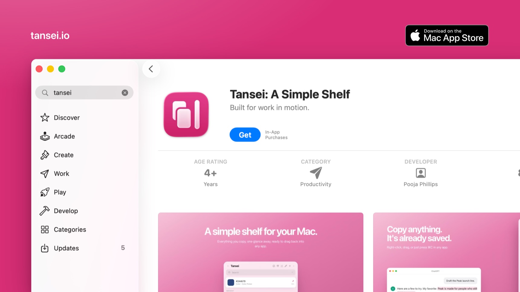
Tansei hit #15 Product of the Day on Product Hunt earlier this month and is now live on the Mac App Store as a one-time purchase: tansei.io · Mac App Store
Now the useful part begins: finding out whether the product decisions that made sense inside my own workflow still make sense when other people use it.
For other builders: what useful feature are you considering that might quietly turn your product into something else?
The discussion is happening over on Indie Hackers →
Back to top